Showing posts with label red. Show all posts
Tuesday, December 19, 2017
Wednesday, November 15, 2017
Another Cover
There is one art director who absolutely knows what to do with the styles of different illustrators. She brings out the best in each of us. This cover was particularly challenging since we were figuring things out as I went along with her suggestions. I wasn't quite sure what she wanted or had in mind and after many attempts at getting it right I wasn't even sure if what I had done had sufficed. I spent sleepless nights.Then when the cover design with my illustration arrived in my inbox, I was pleased by how striking it was. It is therefore with great pleasure that I am showing it off over here.
Labels:
book cover,
illustration,
red,
red and black,
speaking tiger
The Most Beautiful Gift You Can Give, Ever
Many many thanks to Honeycomb printers and to this wonderful artist for telling me about these printers who made this possible.
THE LOVERS
11.5 inches x 9.5 inches
Fine Art Print on Enhanced Matte paper
Rs.2,500 (USD 39)
Postage and handling add Rs.500 within India and USD 15 for
international shipping.
Email me at priya.sebastian@gmail.com
with your postal address, choice of print and number of
copies.
Labels:
#priya sebastian,
lovers,
prints,
red,
red sari,
Verve,
verve.in,
vervemagazine
Monday, August 14, 2017
Partition
The illustration above is one of three I was commissioned to do by the Commonwealth Writer’s website, Adda, to remember 70 years of violent, bloody
Partition of the sub-continent. While I was given complete freedom to conceptualize the illustrations, it was suggested that I make all three with some kind of connecting thread to them. For this I used similar colors, red, black and white and a certain similarity to the landscape.
The illustration above is for
a powerful story called ‘Regional Division’ by Sidra Zia. In the image, to depict division and
violence I’ve used dramatic colors – red and black and torn paper; to show migration, I've poured the mayhem of million birds
in the air, I've splattered red for bloodshed; I want the dramatic illustration to draw out all the emotions in the
story.
The second illustration is for the non-fiction section, Speaking of Partition is a complex piece about communication; language and words in relation to Partition - whether what comprises a language is adequate enough to describe what happened during the Partition, the author is on a train journey, she talks about how the moment you board a train you can sometimes arrive at your destination.
More and more when I read such stories, when I hear Urvashi Butalia talk about her book, The Other Side of Silence, when I read Shashi Tharoor dismantling false constructions that we were (and still are taught in schools), I thank heavens for the power of stories that hold up the truth before our eyes.
Tuesday, April 11, 2017
Friday, January 6, 2017
Tuesday, April 19, 2016
Before We Visit the Goddess
I was very pleased when the Art Director at Verve magazine invited me to illustrate a story by Chitra Banerjee Divakaruni. I had wanted to
illustrate for Verve ever since I saw their beautiful magazine years ago when I
returned from Australia. Then, during pre-internet era, when I contacted them
with samples of my work, they sent me an article to illustrate almost
immediately. However, because of the logistics of couriering actual work across
during those pre-digital times, it was an exercise in futility and nothing
came of it. Therefore I was pleasantly surprised when I received a mail
inviting me to illustrate for them this time.
I haven’t received my copy yet, but a walk along Indiranagar
with a friend and a bid to escape the heat by plunging into air conditioned Crossword
assisted me in getting my hands on a copy and photographing it.Do check out the April 2016 issue of Verve. But you can also read the story here >>
The story is a beautiful one about young lovers, a red sari
and stars in the night sky on the terrace. It was a pleasure to do and it is
one of my favorite assignments to date. The focus of the illustration is on his hands cradling her and her sari enveloping them. The resulting shapes remind me almost of a foetus within a womb, safe, loved and secure.
For those of you interested in such matters, this illustration was done on Canson Colorline paper with the rich pigments of Daler Rowney pastel. I love the grainy texture and the rich but muted, sophisticated colors that resulted. This has been one of those rare moments when there is a sense of satisfaction with what has presented itself to me at my desk.
Labels:
chitra banerjee,
color,
illustration,
lovers,
pastel,
priya sebastian,
red,
red and black,
red sari,
sari,
story,
Verve,
verve.in,
vervemagazine
Wednesday, February 17, 2016
The Werewolf
'It is a cold northern country; they have cold weather, they have cold hearts. A child decides to visit her sick grandmother deep in the forest. She takes her father's hunting knife with her...'
Twenty years ago around this time, I traveled to Australia
to study illustration. There I unlearned and relearned everything I ever knew
about drawing, literature, language and illustration. Apart from expressing myself
in words, I learned to voice my opinions visually. This was akin to learning a new language
except that instead of putting down words on paper, I drew images. But then I learned how to draw these images in a way where they would say what I wanted them to say.I remember I drew far more than I had ever done until then and I remember trying to figure out what worked and what didn’t with my drawings.
The image above was for a story by Angela
Carter called The Werewolf which I did as part of my final project work at Queensland College of Art. It is based on the fairy tale of Red Riding Hood, but with a chilling twist - The wolf who attacks the girl on her way to her grandmother, turns out to be the alter ego of this grandmother-werewolf. The image denatures Little Red Riding Hood accordingly: the figure of the girl and the hood is traditional. The character of the girl and the setting are Carter.
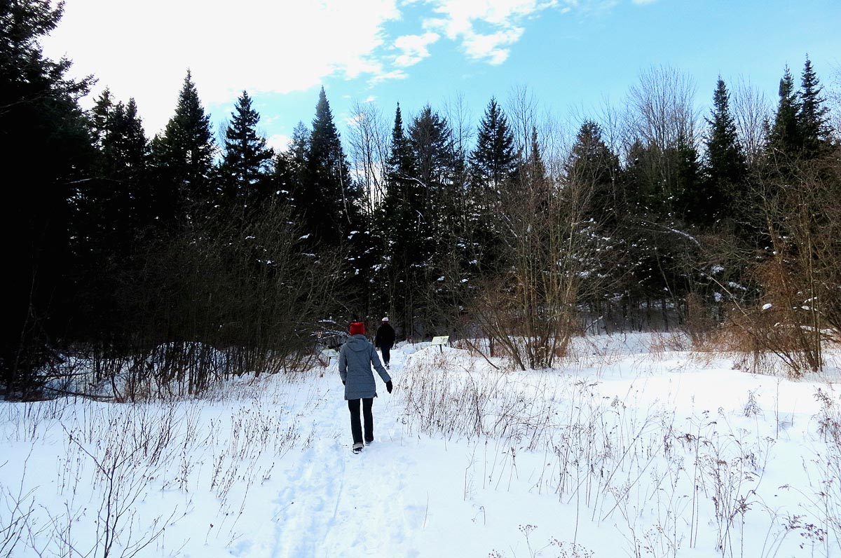
The reason I put the picture above up on my blog was the similarity of the environment within it to the cold winter forests in Sutton (below) where I was taken for a walk. I am surprised that the environment that I created in my image twenty years ago ended up manifesting itself in real life later, even if only for one seemingly endless blink of an eye.
Thursday, November 5, 2015
Uncertainty
And when you go long enough being uncertain of who you
really are, what results is a form of subtle, long-term meditation — a
persistent and necessary acceptance of whatever is arising, because you don’t
actually know if it was the food that made you sick, and you don’t actually
know if you like Eastern European cultures anymore, and you don’t really know
how you feel about income inequality anymore, and you don’t know if your career
path is the best for you or not, and you don’t really know if you miss your
friends back home or if you just like the idea of missing your friends back
home.
And at some point, you just stop asking questions. And start
listening. To the waves and the wind and the calls for love in all of the
beautiful languages you will never understand.
You just let it be. And keep moving.
~ Mark Manson. 5 Lessons from Travelling
Thursday, October 15, 2015
Montreal Sky and Bangalore Color
One early morning sometime at 6am, I ventured outside during
a Montreal winter to catch a bus to Sutton. Around me, the world was a
desaturation of black, white and grey. And then I looked up and saw the sky. It
was this shade of intense blue, the colour I would use as a child to colour in
a night sky but while thinking that skies did not really exist in this
colour and I was using this shade of blue because it was the darkest blue in my box of
crayons. But here it was, that impossible blue as the real thing contrasting against strange shapes in a monochrome world. An hour later, the
sky turned grey, then dirty white and everything looked bleak once more.
And then Bangalore where the brightest of bright colours clash and jostle with each other. Montrealers will wonder what the heck I’ve drawn above while Bangaloreans will instantly recognize a Bangalore sky in October - bright orange of African tulip flowers set amidst leaves that are so dark green they are almost black. Rows and rows of them emphatically making their presence felt against a bright turquoise sky.
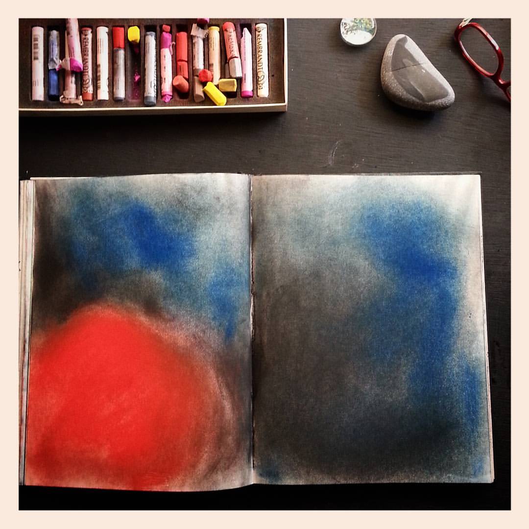
At an Art supply store in Queen street in Toronto I saw
giant bullet-shaped sticks of Senelier oil-pastel obscenely priced at nine
dollars each. Here, an artist down the street has an entire box of them in
different shades of red which I was generously allowed to use.
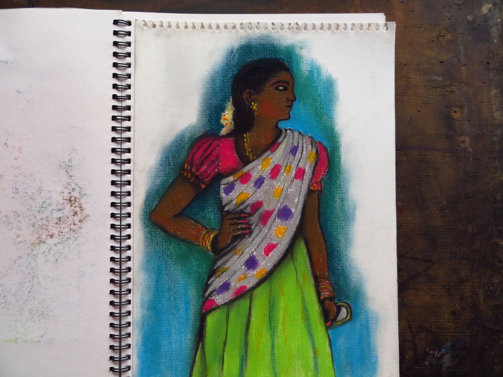
And this beautiful woman standing with confidence in her
Sunday best. I quickly hurried home and drew her in her stunning attire.
Friday, September 18, 2015
Rangoli
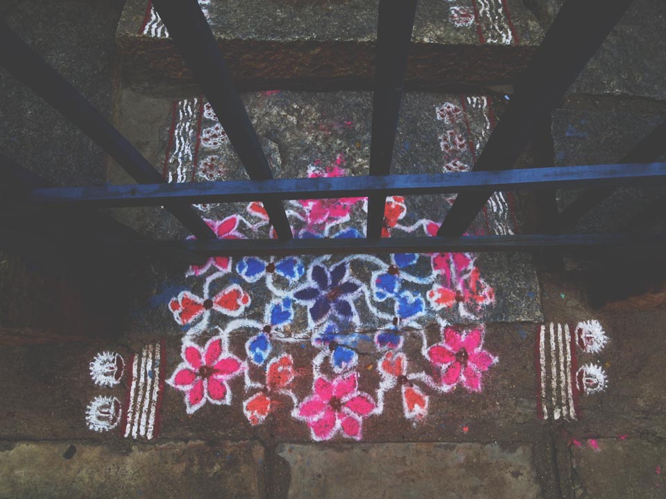
On the way to the shops, I almost always pause for a moment at the gate of this tiny house and admire the colours of the Rangoli on the steps and the vermillion enhancing the doorway.
One does not want to idealize on the blog. Around me there is noise and filth, but beauty like this in the midst of ugliness makes one stop, admire and breathe easily for a moment before carrying on.
India's Chaotic Lesson in Letting Go
Monday, September 7, 2015
Heartfelt
My long time blog readers will know that entwined hearts and tangled vines carefully rendered in graphite is rather unusual subject matter arriving from my table, but I made this picture for a friend of mine who is going off to Italy. She is someone who has shown immense grace, kindness and dignity towards those around her while she was going through challenges of her own.I admire her for that. She once told me what her dreams are and it is that which is what I have tried to depict in this picture. I hope her stay in Italy makes her dreams come true. This is my heartfelt wish for her.
Labels:
drawing,
gift,
heart,
illustration,
red
Monday, August 24, 2015
Gift
There are few experiences nicer in this world than receiving thoughtful gifts, especially if they are what you'd always wanted and they are given to you with love.
2)When I admired a beautiful red cup at a friend's place in Toronto, she bought a similar one for me as a farewell gift.
3) A teeth clenchingly expensive but utterly gorgeous red sketchbook that I had silently admired at a store in Montreal.A few days before I left, a surprise package arrived and in it was the very sketchbook I wanted.
1)Beautiful deckle edged paper posted to me from across the world by a lovely, thoughtful former flatmate. I love that it is wrapped in red, my favorite colour.
2)When I admired a beautiful red cup at a friend's place in Toronto, she bought a similar one for me as a farewell gift.
3) A teeth clenchingly expensive but utterly gorgeous red sketchbook that I had silently admired at a store in Montreal.A few days before I left, a surprise package arrived and in it was the very sketchbook I wanted.
*
Friday, March 7, 2014
Secrecy
Secrecy
Secrecy flows through you,
a different kind of blood.
It's as if you've eaten it
like a bad candy,
taken it into your mouth,
let it melt sweetly on your tongue,
then allowed it to slide down your throat
like the reverse of uttering,
a word dissolved
into its glottals and sibilants,
a slow intake of breath --
And now it's in you, secrecy.
Ancient and vicious, luscious
as dark velvet.
It blooms in you,
a poppy made of ink.
You can think of nothing else.
Once you have it, you want more.
What power it give's you!
Power of knowing without being known,
power of the stone door,
power of the iron veil,
power of the crushed fingers,
power of the drowned bones
crying out from the bottom of the well.
~ a poem by Margaret Atwood
Perhaps it is about time I finally posted these illustrations
here. If it hadn't been for Robyn's email that I send them to her, they would
never have seen the light of day.
I did these illustrations many many years ago
after being stunned by reading Margaret Atwood's poem Secrecy. I felt the
illustrations needed an abstract approach and I did that. But as sometimes
happens, I was unsure about their effectiveness in partnering Atwood's intense
and powerful poem so I kept them away. Until that is, I left a comment on Robyn's inspiring blog ArtPropelled for her fabulous post on Book of Secrets that I had happened to make
these drawings. Now these illustrations are up there on her blog too, along
with those other stunning works of art.
As Robyn said, 'it was serendipity at work'.
Labels:
charcoal,
illustration,
Margaret Atwood,
poem,
red,
red and black,
Secrecy
Sunday, October 6, 2013
Illustrations for Current Conservation Magazine
Every
person who draws knows that there are two kinds of audiences – the cultured and
the philistines. One never ever knows who will fall into which category until remarks
are made about art.
Long ago,
at the recommendation of a well wisher, I took my spanking new portfolio of
illustrations enthusiastically to the big boss of a newspaper. The man's family had owned the newspaper for decades, he reeked
wealth within his wood panelled room. The boss flipped through my portfolio politely
and a trifle disdainfully declared, ‘who wants this sort of thing ya?’ Then he
called an editor and said dismissively, ‘give her an article to illustrate’. I
illustrated the article, I got paid many months later and that was all there was to
it.
Fast
forward to over a decade later, I went to meet the editor of an environmental
magazine at the Indian Institute of Science campus. I was directed to a modern
building full of light and air; the scientist who was editor of the magazine spoke
very knowledgeably about illustration; he said he wanted the magazine to be a ‘platform
for illustrators’ and he stated that the editors of the magazine ‘would like to build a
relationship with the illustrators’.
The
newspaper from years ago has over time reduced itself to a sensationalistic rag.
As for the environmental magazine, when one looks at the content, the design,
the quality of the printing and the visuals, the vision of the editors is apparent.
The process for one of my illustrations can be seen over here >>>
Labels:
Australia,
Current Conservation magazine,
illustration,
red
Subscribe to:
Posts (Atom)