I used to assume POOL Magazine was some sort of bastion for alumni of all the national design, art and architectural colleges, however it looks like things have changed somewhat since I formed my initial presumption because much to my surprise, they asked me for an interview, me, Priya from the local art college who had that tryst with fate and illustration at Queensland College of Art long long before anybody even knew what the word illustration meant at all.
Since you can read the POOL interview only if you "pay" for it and since I cannot quite imagine anyone doing that or even ordering a copy, I am going to put the entire interview on my blog here. And what's more this will be the unedited version with all the undercurrents intact since without that it wouldn't quite be me.
So here it is below for anyone who cares to read it -
How did you fall in love with drawing?
Drawing was
something that I enjoyed and did a lot of as a child. Senior classes in school
effectively killed that off with their focus on studies and drawing if any was
about diagrams for Biology and careful pencil shading in Art class which is
horrible really because that isn’t what drawing is about at all. Rather than
falling in love with drawing, I ended up avoiding it because no one seemed to
know what the ability to draw well could ultimately lead to, therefore it was
not encouraged; this was the 80s after all. I studied Science for a while in an
attempt to please my parents and ended up making myself completely miserable. I
made my way to the local art college and enrolled myself there in an act of
desperation. I ended up doing even more pencil shading in Art College and the
three year Applied Art course effectively and completely killed off not just my
ability to draw but any other forms of creativity within me as well. I was
disgorged from the art college mentally and creatively amputated and it was in
such conditions that I was supposed to make my way in the real world as some
kind of professional creative being. When I look back at my attempts to “fall
in love with drawing” in my youth, it was a complete nightmare.

During a stint in a design agency, I discovered that there was a profession
called “Illustration”, something which involved illustrating stories. Wanting
to study it further and after exploring all kinds of ways to find the means, I
ended up enrolling for a Master’s degree in Illustration at an art college in
Australia. I landed there pretty clueless of course. Seeing my desire to learn,
the teacher who was my supervisor asked me to place my pencil aside and handed
me a stick of charcoal. This changed my entire approach to drawing. It removed
my drawing from the claustrophobia of corseted realism into interpretations that
were uniquely and unapologetically mine. It was a shift from working as
carefully as a surgeon with a sharp pointed instrument into creating an image
with something blunt. This required a complete change in mindset. From years of
doing detailed photographic rendering, I now had to create an impression, my impression, of elements that
constituted an image. I had to relearn what it meant to be spontaneous so that
my drawings breathed with energy. I had to think about what I wanted to say and
how I wanted to say it. I had to use my imagination. Drawing became an
adventure into the unknown. The process of making an image became exhilarating
and fun as never before. In time, thanks to the directness of working with
charcoal, by using my hands and fingers to draw, I learnt to love drawing again
and to do it with the same spirit that I did as a child.

Tell us about your formative years. What has been the role of formal education in your career?
I don’t think my
schooling had any role whatsoever to play in my career. I went to a school that
was a remnant of this country’s colonial past. The system was very formal and
rigid and we were encouraged to conform and obey in dress, mannerisms and
thinking to the point where at times it felt like an army boot camp. We had a
bunch of Anglophile teachers who thought it was their job to civilize the
natives. Questioning of the teacher was never really encouraged except to answer
a tentative doubt and both questions and answers were written for us on the
blackboard which we mugged up and reproduced at exams. Unsurprisingly my school
has produced very few artists. A good metaphor for school life would be the
carefully drawn still life from art class done with detailed pencil shading,
very neat and correct but completely lacking imagination and originality. At
the end of my schooling I was a clone of something society expected me to be,
something nebulous enough for external powers like family, marriage and
religion to write whatever script they wanted to over me.

What does it take to become a successful artist?
Becoming a successful artist is not only about practicing a skill but about consciously questioning what it is that we have been taught to believe. Is it necessary for us to hold on to values handed down to us by family, religion, teachers and mentors for the rest of our lives or should we re-examine and discard what usually are one-dimensional concepts suited to a particular time and space? When you constantly search, question, imbibe, reject and experiment, you allow your mind to expand and deepen. You learn to trust your instincts and accept your feelings about situations. This gets reflected in the art that you make. The process of becoming an artist of worth is a slow process which takes a lifetime to unfold. It can also be an organic and beautiful one if we allow it to be.
You seem to work primarily in Black and White? Can you tell us about your preference for charcoal as your chosen medium for illustration.
Black and White is structure and bone. It digs into the truth with decisiveness. It might be sensual but it is also intellectual. A picture in color is to be looked at but Black and White compels us to think.
Charcoal is decisive and subtle, strong yet sophisticated. These varied qualities allow me the clarity and expressiveness I desire while making an illustration.
You have been an educator, what are the principles by which you teach your students to illustrate?
When I teach students the art of illustration, I teach them to have an opinion, to have a point of view that is their own and to justify it by expressing it visually in relation to the text or story given to them. I do this through one on one discussion, analysis of the subject and assisting in the process of conceptualization. I encourage my students to look at the works of great masters, analyze how they solved visual problems in their paintings and to incorporate those principles within their own illustrations. I firmly believe that if you look at and truly learn to appreciate great art, it reflects in your work in various ways. I also go to great lengths to generate confidence within students and to teach them not to be diffident about expressing themselves. There is nothing more rewarding for a teacher than to be a catalyst in the process of creating an effective illustration.
Tell us about a few projects most memorable to you.
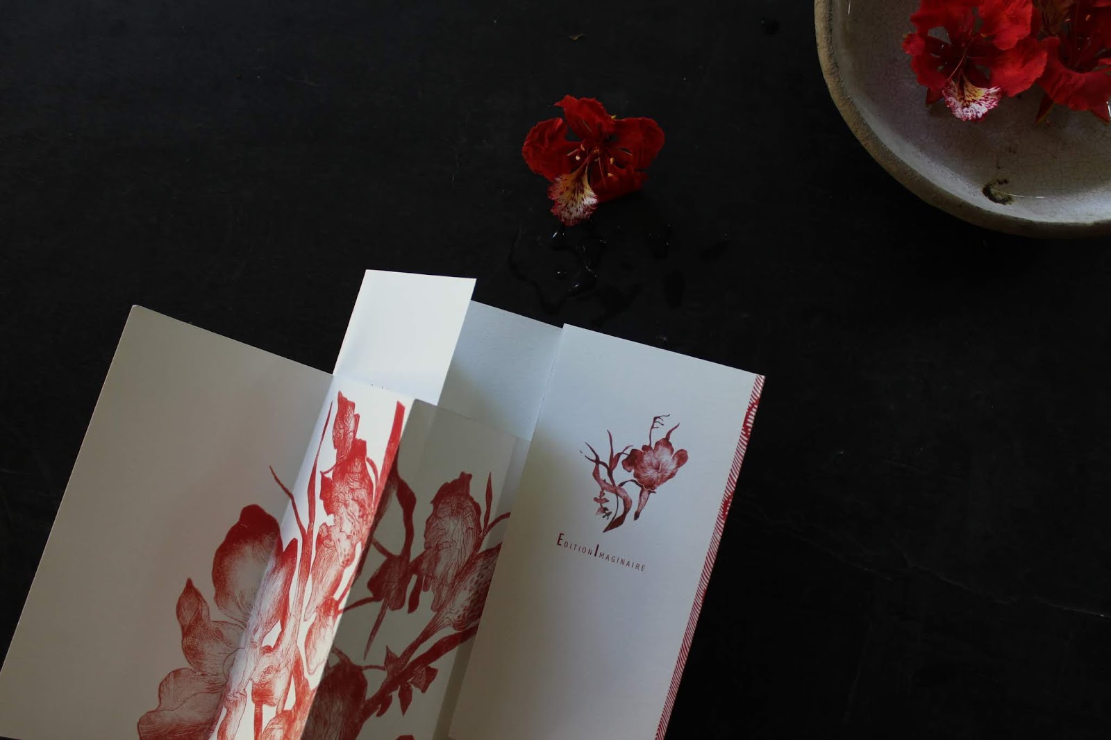
One of the projects I thoroughly enjoyed working on last year was a commission by the Commonwealth Writer’s to make illustrations for two stories and a poem on the theme of Partition of the Sub-Continent in its 70th year. There had to be a common visual theme for all three images which was to appear in their website. I made the images primarily in black and white with touches of red; these are colors that are visually striking and graphic to get the message across. I used mountains in all three images as a common factor to link them. I used red color and tearing of paper to indicate conflict, partition and attempts at bridging them. The resultant images are visually powerful and while I usually work with my hands, in this case I also scanned the drawings and layered them digitally to create depth and complexity to echo and reinforce the message of the stories.
I do quite a lot of work for The Indian Quarterly magazine and the excellent stories they give me to illustrate continue to be my favourite projects of all. These stories are usually set in different parts of the country, Kolkata, The North East, the latest one from Goa, and they usually focus on some universal aspect of the human personality like prejudice, manipulation, desire for escape or a weakness of some sort. I have to solve the puzzle provided by the story, not by giving away the answer in the image but by providing a visual counterpoint. The best images in my portfolio are illustrations for this wonderful magazine.
Share some experiences of working with publications.
It is all pretty straightforward really, the art director gives me the story and the size of the image, I send him or her the concept drawing, it is approved by the team, I then finish up the final illustration and deliver. Most art directors who have worked with me are familiar with the quality of my work and don’t interfere too much. They trust me to deliver a good, worthwhile end result. This is a trust that I am careful about maintaining.
Where do you draw inspiration from?
Having trained to become an illustrator in a Master’s course which involved analyzing as well as visually amplifying literature from my chosen area of research, my inspiration usually comes from what I read. A beautifully written paragraph in a book that I am reading can inspire me to make an illustration, at other times, a poem I come across would make me do the same. It is almost always the text or story that inspires an illustration.

The shapes of things interest me. In different places I travel to, the shapes of things are usually different from what I am familiar with – boulders, sea shells, houses, seed pods…I examine these in drawings in my sketchbook. In Montreal I got to experience my first winter. The world turned black and white, the sky turned the same color as the snow and the dark shapes of leafless trees set against this completely white background made them look as if they were floating in mid-air. It was a completely different world. At that time, the style of my drawings in my sketchbooks changed completely when I was recording those scenes around me. My lines became very clean and severe and my images acquired a stark quality to them as opposed to the energy and movement that is usually associated with my work.

How do you balance the creative and commercial sides of art?
In this question, I think what is really being asked of me is “How do I survive as an illustrator given the fact that illustrators are paid as little as they are.” The answer is simply this; it is very, very challenging to make a living as an illustrator. It isn’t a profession in which you make money but rather a profession that you have chosen because you love doing what you do. All of us, my illustrator colleagues and I, try everything to make ends meet, we sell our work, we sell prints of our work, take workshops, teach, reason with clients to pay us more etc. However if the focus is on “Where is my next cheque going to come from?” life becomes suffused with anxiety which bleeds into your work and that is hardly a way to live let alone create. Ultimately I can only say that in my case I have learnt to live with less, which has been liberating because my sole focus is on doing really good work. In the end, that is all that really matters to me.
What is the one piece of advice that you live by?
The job of an illustrator can be exhilarating and yet at times it can be the most frustrating and isolating job ever. Like every other profession or aspect of life, it has both its triumphs and challenges. There is one quotation I came across a few years ago which I pretty much look at as often as I can. It serves as a kind of compass needle which always redirects me back to what is truly important in my life. It is this piece of advice by artist Teresita Fernandez:
"And lastly, when other things in life get tough, when you’re going through family troubles, when you’re heartbroken, when you’re frustrated with money problems, focus on your work. It has saved me through every single difficult thing I have ever had to do, like scaffolding that goes far beyond any traditional notions of a career."