Sunday, December 29, 2019

La Citta


Click on the images for bigger pictures ~


I have not told half of what I saw for I knew I would not be believed.
~ Marco Polo


Do head over to Hello Every Sunday for more and bigger pictures.

Thursday, December 26, 2019

Fable of Our Times.


Text found on the Instagram account of Vidyanand Jha, reposted by @treescapes on his stories. I added my illustration to it.

Monday, December 9, 2019

Fine Art Prints from my Book

So I have just received these utterly gorgeous fine art prints of my illustrations for my book. They are printed on thick, luxurious Hahnmuele paper and they are each 12 inches in height. They look fabulous in real if I may say so myself. These photographs don't really do justice to the richness and beauty of these prints.

These can be ordered directly from me via my email priya.sebastian@gmail.com
- They are limited edition of only 50 prints per picture.
- Each print is signed and numbered by me, the illustrator. 
- Each comes at a price of INR 2500 + 500 for postage.

CAKE


LOVE


BIRDS


PRAYER


BODY


GIRL


My Book


Available for both domestic and international shipping at:

Sunday, December 8, 2019

A Brand New Website for Hello Every Sunday


Most of this year my drawings were restricted to professional work, I barely drew for fun and pleasure, I don't think I sketched at all. This ends up causing a kind of listlessness towards life so I asked Julie if we could resume Hello Every Sunday. For a few weeks we uploaded on Instagram because that is where everyone congregates, but Instagram for images is like hospital food for a meal, it leeches out flavour. Then Julie suggested something better, a Wordpress website. Since Julie is a web designer, she built it and here we are showing it off today -

Do click on the link HERE for large, generous and opulent images of our daily drawing.

This is the best incentive to draw every single day.


Friday, December 6, 2019

On the train to Matera


These are some drawings in my sketchbook of my train journey to Matera.
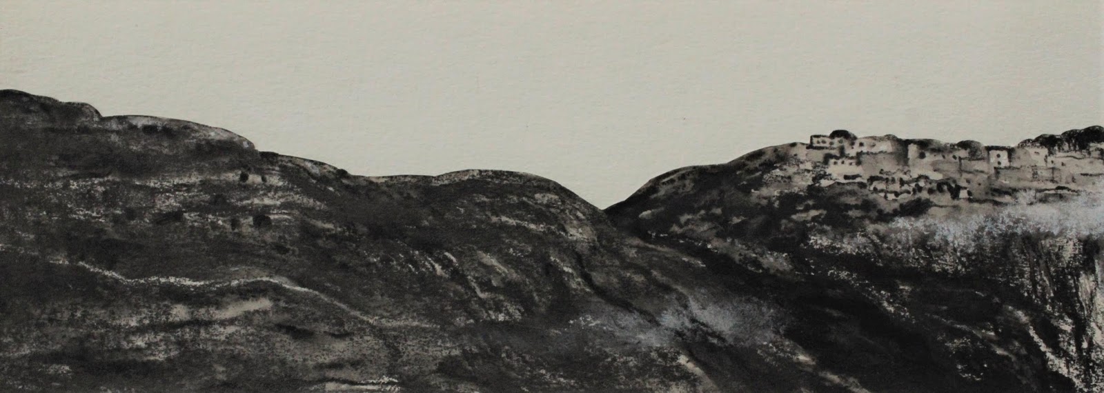
When I saw the Italian countryside landscape for the first time, I understood better what the old Renaissance masters had painted.  My usual bold charcoal drawings did not work very well for these landscapes. I felt it needed something softer and more poetic. Derwent graphite with its muted tones worked very well for the rolling hills and Olive trees. However I wanted to experiment with other media so I tried ink, my first foray into wet media.


My initial attempts at ink are reminiscent of how I use charcoal, my approach was the same, I let the fountain pen ink that I used literally gambol on different kinds of paper. It was pretty much hit and miss every time, some worked but most did not and there were many, many trials and errors for about two weeks (below). 


Then on a suggestion from a friend, I used a bottle of Sumi ink that had been gifted to me last year (one of those rare, thoughtful gifts that I could actually enjoy). I used tiny rectangles of cheap paper from a small notepad I had and strangely and much to my surprise it worked. The pictures had a print like quality to them which recreated the atmosphere that I wanted (below).


My long journey to Matera which began at 5 am went like this : Trastevere to Rome, Rome to Bari, Bari to Matera. Here are some of the sketches of my co passengers.
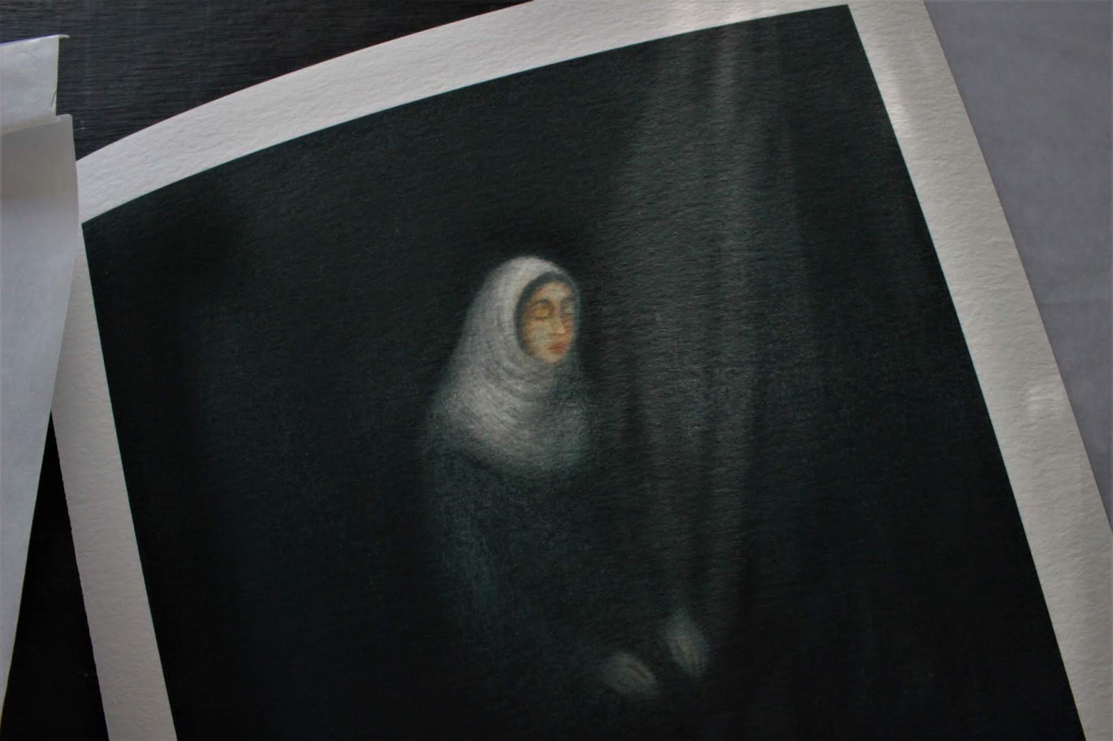


I felt compelled to redraw the sketch of the schoolgirl with red streaked hair and distinctive features into something larger. Her face reminded me of a Renaissance portrait. I think I should title the drawing of her as Sleeping Madonna (above).


While making these drawings I recall the sense of anticipation I felt sitting in the slow train which glided leisurely through the Olive groves and towards my destination.


There is a resumption of daily drawing over at Hello Every Sunday. We even have a brand new website with large images. Do meet us on Sundays to see our daily drawing progress at
HELLO EVERY SUNDAY.

Thursday, November 14, 2019

A Woman's Worth


I am pleased to finally show off my cover illustration and design for the book, A Woman's Worth, a study of Indian women's bodies from conception to old age and death. Researched and written by Australian journalist Sophie Cousins and published by Yodapress in collaboration with SAGE, the first few chapters which were sent to me read like a Stephen King novel; but this was fact, not fiction, in this country a woman is ultimately a receptacle for breeding a male child, until she does so she is barely considered human.


I resorted to using an analogy which I thought was very apt to describe the situation in which an Indian woman finds herself: I represented a woman within a Pitcher plant to show that a woman's womb is made to kill that which it is supposed to nurture (female foeticide), in a sense much like the Pitcher plant itself. Alternately, the Pitcher plant in this cover illustration can also be a metaphor for Indian society which rather than giving a woman the freedom to grow, inevitably captures and destroys her through its societal norms.

Here is the initial conceptual sketch that I sent the client:


I have to add here that after two decades as an illustrator, I am pretty much given free reign to do what I want and that is when I do my best work. 

After approval, I developed the concept, which can be seen in the images below.


So the image above fell apart because of the lurid colour scheme, so I redid the drawing to the one below which is better.


The kind of paper I use and how it partners with the pastel and charcoal becomes very important in articulating what I want to say within the image.I wanted a darker quality to the image, striking as a book cover should be but with an undercurrent of unease as befits the subject that it is about. In the top image I have used Strathmore paper, in the bottom image I have used Rembrandt pastel on equally expensive Arches paper. Not only is the effect immediately striking, the feel of pastel on the surface of the paper is music to my hands. The process becomes enjoyable and when that happens the illustration turns out very well.


Then I scanned the image and using InDesign, I added the lettering and selected the right colours for the fonts. 
Below is the final cover illustration and design.

Here, I must express gratitude to some of my colleagues (you know who you are), for helping me decipher the mysterious measurements given to me and helping me navigate the pathways of InDesign, and to my friend sitting somewhere in the hills of Landour, for putting the author Sophie in touch with me for this excellent project, many, many thanks.

Well, another job done.